
Business Challenge:
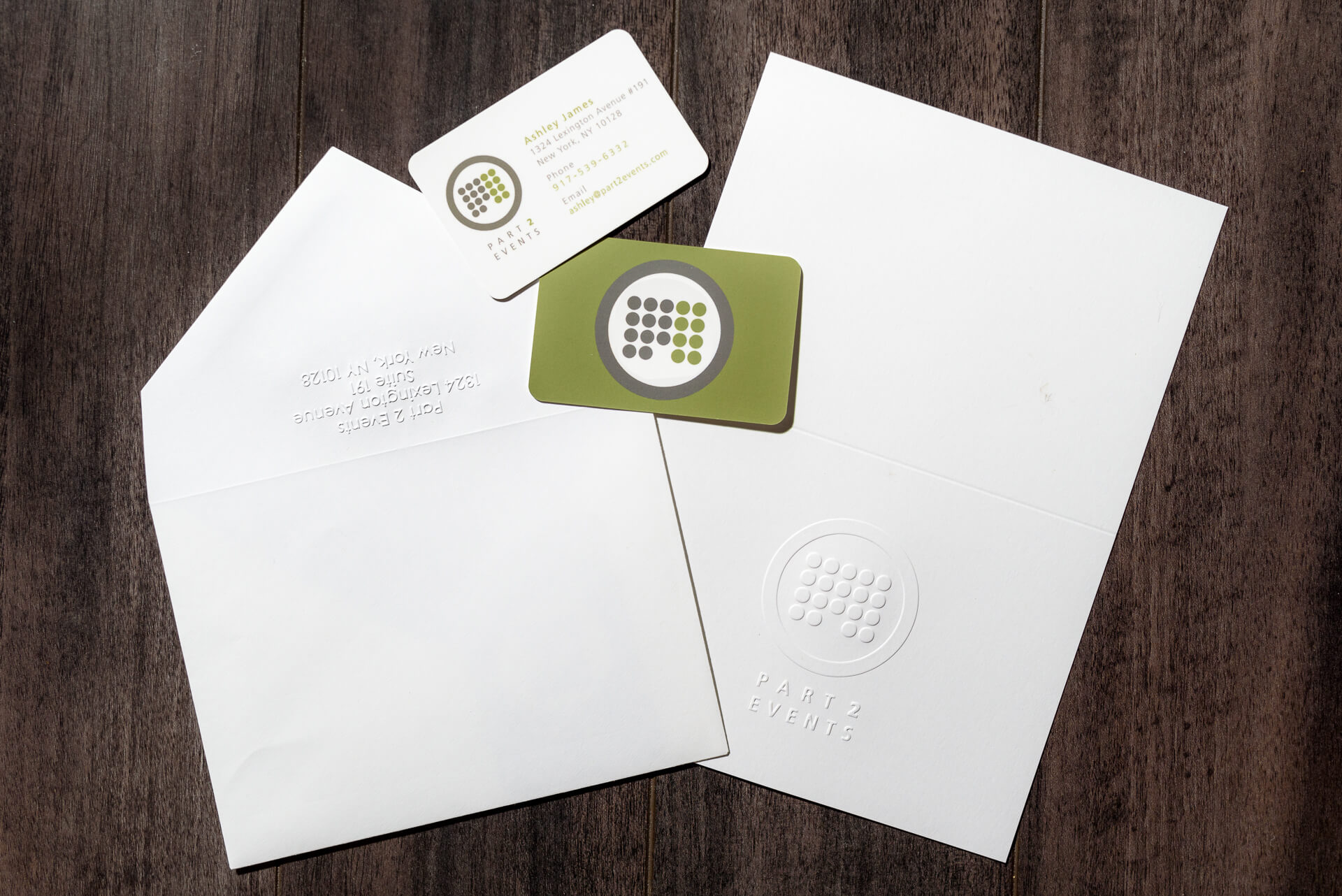
A start-up meeting & event management company needed new branding
and wanted something simple, yet iconic to set them apart.
Keenan Creative Forces Solution:
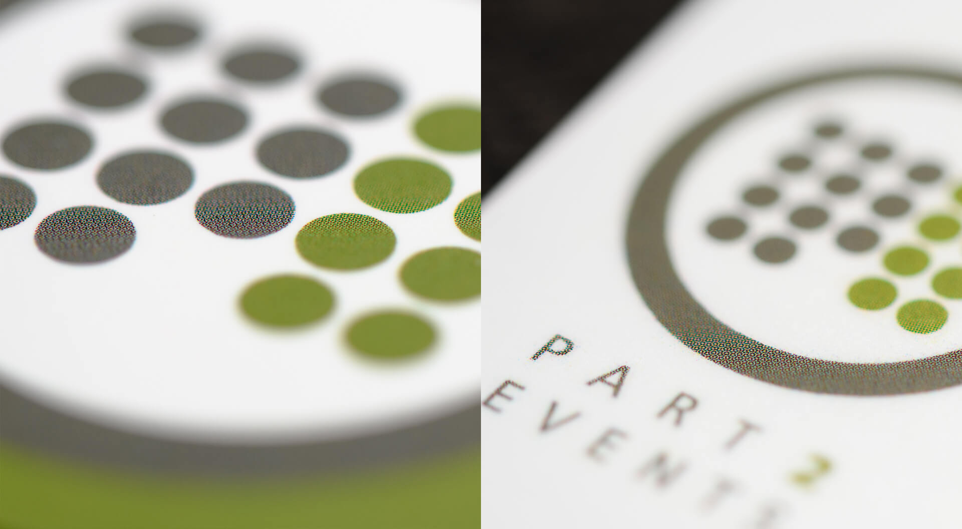
We used dots to portray the “P” from Part and the “2” and when placed together
the matrix resembles a building, which is where most meetings are held.
Client Feedback:
“Branding is critically important, particularly for a new player in a competitive arena, and
Keenan Creative Forces logo design for us delivered precisely what we were looking for.”
— President, Part 2 Events


